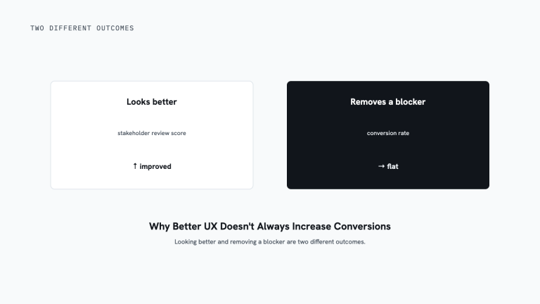
Design your website’s UX backward from the conversion action you want, the completed purchase, the submitted form, the booked call, not forward from the homepage. Fixing the step closest to that goal first pays off fastest, because a visitor that close has already decided they’re interested.
Whatever your website is for, it exists to do one job: move a visitor toward an action that matters to your business. That action is your conversion. The mistake most teams make is designing the site from the homepage forward and hoping conversions fall out the other end, the same reason designing backward pays off before a redesign too.
Key takeaways
- Design backward from the conversion action, not forward from the homepage.
- The end of the funnel is where effort pays off fastest, because that visitor has already decided they’re interested.
- A responsive layout that fits every screen isn’t the same as serving the person actually on it.
- Find the step with the steepest drop-off closest to the goal, and fix that first.
Is this actually your problem right now?
This guide covers how to sequence a UX redesign around your conversion goal. It doesn’t cover two adjacent problems that look similar but need a different starting point.
Stop reading here if:
- You don’t yet know which step in your funnel is actually losing people. How to find what to improve on your website covers finding the weak point before you redesign around it.
- You’re deciding whether to redesign all at once or in small steps. The case for an iterative website redesign covers that sequencing question directly, this guide assumes you already know you’re designing backward and covers what that looks like in practice.
If neither describes you, the questions below are the right starting point.
What does “start with the end in mind” actually mean?
It means you fix the goal first, then design every step leading up to it in reverse order.
Take an ecommerce site. The end goal is revenue, so the place to start is the bottom of the funnel: the cart and checkout. That’s where intent is highest and where money is won or lost. If people who reached the cart are dropping out, no amount of homepage polish makes up for it. So you start there, reduce the friction, and get more of those ready-to-buy visitors through.
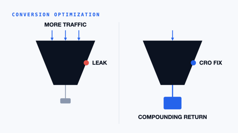
Only then do you move up the journey, the product page, the category page, the content and blog pages that feed the funnel, improving each step to carry more people forward. The homepage comes last. It matters for branding and for telling your story, but it’s rarely your most important conversion page. If you’re paying for ads that drop visitors onto the homepage instead of a page built to convert them, you’re likely paying for traffic that leaks straight back out.
Why work backward instead of front to back?
Because the end of the funnel is where your effort pays off fastest, a visitor near the conversion has already decided they’re interested. Removing one obstacle in front of them recovers a sale you’d otherwise have lost outright. Improving the homepage, by contrast, helps people who are still deciding whether to engage at all, valuable, but slower to show up in revenue. When you start at the end, your earliest changes land on the people closest to buying, so you see the return sooner and learn what’s actually blocking conversions before you invest in everything upstream.
How do you design for the right device and the right moment?
Build the experience around how each person actually arrives, not around a single layout you hope covers everyone.
Most modern sites are responsive: the page detects the screen size and rearranges itself to fit a phone, tablet, or desktop. That’s the baseline, and it’s necessary. But fitting a screen isn’t the same as serving the person on it. Someone browsing on a phone during a commute has different needs and constraints than someone comparing options on a desktop with time to spare. The goal is to deliver the right experience to the right person on the right device at the right moment, not just a layout that technically reflows. That’s where personalization earns its place: tailoring what a visitor sees to their context so the path to the conversion feels obvious instead of generic.
Where do you start tomorrow?
Pick your single most valuable conversion and trace the steps a visitor takes to reach it, starting from the action and moving backward. Find the step with the steepest drop-off, the one closest to the goal, and fix that first. Then move up one step at a time. You’ll improve the pages that matter to revenue before you spend a day on the ones that mostly look nice.
Alt text: Funnel diagram ranking design priority from the conversion action down to the homepage, with the conversion step marked highest priority.
Score your redesign priority before you touch a page
Score each page 0 to 2 on how close it sits to the conversion action, then start with the highest total. This turns “the homepage needs work” into an actual sequencing decision.
- How close is this page to the conversion action? 0 = several steps removed (a blog or content page). 1 = one step removed (a category or comparison page). 2 = the conversion step itself, or the page directly before it.
- How much traffic does this page carry toward that conversion? 0 = low. 1 = moderate. 2 = one of the highest-traffic steps in the path.
- How steep is the drop-off at this step today? 0 = performing fine. 1 = a noticeable but moderate loss. 2 = the steepest drop-off in the funnel.
Add the three scores. Start with the highest total, work backward one step at a time, and don’t touch the homepage until the pages closer to revenue are already fixed.
Frequently Asked Questions
Does this backward approach work for a lead-gen site, not just ecommerce?
Yes. The conversion action is just whatever matters to your business, a submitted form or a booked call instead of a completed purchase. The same principle applies: find the step closest to that action and fix it first, then work upstream toward the page that first brings someone in.
My checkout or form is already well optimized, where do I look next?
Move one step up the funnel from wherever you last fixed something, toward the product or service page that feeds it. The same backward logic still applies: the step nearest the parts you’ve already proven out is usually the next-highest-leverage place to work.
How do I know which step actually counts as “closest to the goal”?
It’s the last step a visitor completes immediately before the conversion itself, the final form page before submission, the cart before checkout, the review screen before a booking confirms. Trace your own funnel backward from the completed action and that step will be obvious once you map it out.
What to do next
- Trace the steps a visitor takes to your most valuable conversion, starting from the action and working backward.
- Find the step with the steepest drop-off closest to the goal and fix that first.
- Score each page on closeness to conversion, traffic, and drop-off severity before you touch anything.
- Design for how each visitor actually arrives, not a single layout that technically reflows.
- Since the cart and checkout are usually where this backward design starts, see the Practitioner Lesson The Closer a Step Is to Revenue, the Less Room There Is for Ambiguity.
Continue based on what you need next
- You don’t know yet which step is actually losing people: how to find what to improve on your website pairs quantitative and qualitative data to find the weak point before you sequence a redesign around it.
- You’re deciding between one redesign or ongoing small changes: the case for an iterative website redesign covers that sequencing question directly.
- You want the full methodology this fits into: conversion rate optimization covers the diagnose-prioritize-test cycle a backward-designed UX serves.
Designing backward from the conversion is the difference between a site that looks finished and one that actually performs. If you want a clear read on where your funnel is leaking and which step to fix first, that’s exactly what a conversion review is for. Book a consultation and we’ll take a look.
Alex’s Perspective
The teams that get this wrong aren’t lazy, they just start where it’s easiest to start: the homepage, because everyone has an opinion about it. The teams that get it right start where the money actually changes hands and work backward from there, even when that means the homepage waits its turn.
Where this fits
This is a Discover and Prioritize article: sequencing a UX redesign by revenue proximity so the first page you touch is the one closest to the money, not the one easiest to have an opinion about.
Alex Harris leads AlexDesigns’ conversion optimization work, applying this backward-design sequence before a single page gets redesigned.