Most lost conversions are quiet, not dramatic: a hesitant form field, a page answering the wrong question, a price revealed too late. The six mistakes that cost businesses the most customers are unclear CTAs, over-long forms, self-focused copy, hidden pricing, an ignored mobile experience, and redesigning instead of testing. Here they are in plain language.
Are you making visitors guess what happens next?
If a visitor has to pause and figure out what to do next, most of them won’t bother; they’ll just leave. This shows up as a call to action that’s vague (“Learn More” instead of a specific next step), buried below content that should come after it, or competing with several other buttons for attention. A page with three equally-weighted buttons is asking the visitor to make a decision you should have already made for them. The fix isn’t a bigger button; it’s a clearer, more specific one, placed where the visitor’s eye naturally lands right after the sentence that convinced them to act.
Are you asking for too much, too soon?
Small frictions don’t fail loudly; they accumulate, as the stack below shows.
Every field on a form is a small reason to stop; asking for information you don’t need yet costs you visitors who would have converted with a shorter form. A contact form that asks for phone number, company size, and budget before someone has even decided you’re worth talking to is trading a lead now for information you could get in a follow-up conversation. The businesses that convert best usually ask for the minimum needed to start the relationship, and get the rest later, once trust already exists.
Are you talking about yourself instead of the visitor’s problem?
A homepage or landing page that opens with “We are a company that…” is answering a question the visitor didn’t ask; they came with their own problem, not curiosity about your company. This is one of the most common and most fixable mistakes: leading with what the business does instead of the problem the visitor is trying to solve. The fix is usually a reordering, not a rewrite: put the visitor’s problem and the promise of solving it first, and let the “who we are” come after you’ve earned the attention. Most of the words on the page rarely need to change, only their order.
Are you hiding the price, the timeline, or the catch?
Anything a visitor has to hunt for, such as price, how long something takes, or what’s not included, reads as something you’re avoiding, even when you’re not. Vagueness where a number should be tends to create more hesitation than an honest number would, even an unfavorable one. If pricing genuinely varies too much to post, say clearly what it depends on instead of staying silent, so the visitor can at least estimate where they’ll land before they ask. The same goes for timelines: “it depends” with no range attached reads as evasive, while a real range, even a wide one, reads as honest. Visitors rarely walk away from an unfavorable number; they walk away from the feeling that one is being kept from them.
Is your mobile experience an afterthought?
A page that was designed for desktop and just “works” on mobile usually loses far more mobile visitors than anyone notices, because the traffic still arrives; it just doesn’t convert. Small tap targets, text that requires zooming, and forms that are painful to fill out on a phone are common on sites that were never actually tested on one. If a meaningful share of your traffic is mobile, that experience deserves its own review, not an assumption that “responsive” means “good.” A layout can pass every responsive-design check and still fail the visitor if a button sits under a thumb’s natural rest position, or a field requires a keyboard switch mid-form. Test the actual conversion path on an actual phone, not just the page rendering.
Are you redesigning instead of testing?
Use the framework below to turn this list into a quick self-audit.
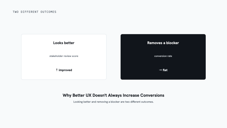
Changing a page based on opinion instead of evidence means you never actually learn whether the change helped; you just have a newer-looking page and the same open question. This is the quiet mistake behind most of the others: without testing, a business can carry an unconverting headline, an overloaded form, or a buried price for years, because nothing ever confirms it’s the problem. See what is CRO, really? for why evidence-based testing is the part that actually closes these gaps, not the redesign itself.
What to do next
- Pick your highest-traffic page and read it as a first-time visitor would, not as someone who already knows the business.
- Count the fields on your main form. If you can’t explain why each one is needed before the first conversation, it’s a candidate to cut.
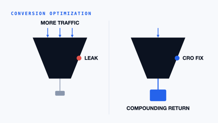
- If you suspect one of these is costing you but aren’t sure which, where your funnel actually leaks is the place to start narrowing it down.
- For the full picture of how fixing these adds up to a real process, see the plain-language CRO guide.
If you want a second set of eyes on your site for exactly these patterns, start with a free assessment: we’ll tell you plainly what we find, mistake or not.
Alex’s Perspective
Across 1,000s of conversion audits, the mistake that surprises clients most isn’t the one on this list they expected. It’s usually “talking about yourself instead of the visitor’s problem.” It’s invisible from the inside because the business already knows what it does; the visitor doesn’t, and the page never told them. The fix, once someone points it out, is almost always faster than the client expects: it’s a reorder, not a rebuild, and it tends to be one of the first things we change in an audit because it costs nothing to test. Clients are usually more surprised by how little the actual sentences had to change than by the mistake itself.
Where this fits
This is a Discover article: naming the quiet friction points before they get prioritized and fixed. Most of these mistakes hide in plain sight until someone reads the page as a first-time visitor instead of an insider. Once you can name a mistake, it moves from “vague sense something’s off” to “the field on step two of the form,” which is what makes it something you can actually test and fix instead of something you just feel.
Alex Harris leads AlexDesigns’ conversion audits, where this list gets checked against a real site, page by page. Every pattern above is one we’ve actually seen repeat across audits, not a generic best-practices list assembled from memory.